Intro to Framer Motion
Published on July 24, 2019
Framer-motion is a library that powers animations in Framer, and it’s now available as an independent package that we can use in React applications. It has a very simple declarative API that makes it easy to create and orchestrate complex animations with a minimal amount of code. In this article, we’ll start with very basic animations and gradually move to the more advanced ones.
Note: animation examples in the article may not look smooth because of a low frame rate of GIF images. Rest assured, real animation are butter-smooth. You can play with them in the sandbox here.
Setup
We can start with framer-motion by simply installing it with yarn add framer-motion command.
To animate elements, we’ll need to ditch primitive HTML elements (div, span, path, etc.) in favor of their “motion-infused” counterparts - motion.div, motion.span, motion.path, etc. These elements expose the properties that we’ll need to add our animations.
Get things moving
To create the simplest animation, we can specify animate property that accepts an object with CSS properties that we want to animate. This is how we can animate opacity and background color of the div:
import { motion } from "framer-motion";
const One = () => (
<motion.div
className="rectangle"
animate={{
opacity: 0.5,
background: "#ff00b1"
}}
/>
);

The properties that we pass to animate represent the final state of the animation. Framer-motion will infer the initial state based on the specified CSS properties, or their defaults. For example, default opacity for CSS elements is 1 (even if we don’t set it explicitly), so framer-motion knows how to animate it down to 0.5.
We can also set the initial values of animatable CSS properties using initial prop. It also accepts an object with CSS properties that will tell framer-motion what initial values should be like. In the example below, we fade in the rectangle by animating y and opacity properties:
const Two = () => (
<motion.div
className="rectangle"
initial={{
opacity: 0,
y: 50
}}
animate={{
opacity: 1,
y: 0
}}
/>
);

It’s worth mentioning that property y is special - it’s not a real CSS property, but framer-motion understands it. There are a bunch of CSS transform-related properties that have shortcuts in framer-motion, so when we change y property, we actually apply animation to transform: translateY() property. Similarly, there are scale, rotate, scaleX, scaleY and some other properties, you can find the complete list here.
Animating state changes
The animations that we’ve done so far only run when components mount. Now let’s see how we can animate elements when some internal state changes.
We can set animation property to different values based on the internal state, and framer-motion will animate between those values when the state changes:
const Three = () => {
const [active, setActive] = React.useState(false);
return (
<motion.div
className="rectangle"
animate={
active
? { background: "#ff00b1", rotate: 90 }
: { background: "#0D00FF", rotate: 0 }
}
onClick={() => setActive(!active)}
>
Click me!
</motion.div>
);
};

Note that the component re-renders only when state changes, and not on every animation frame, which makes animations very efficient.
Variants
The real power of framer-motion comes from using variants. Let’s start by exploring how we can rewrite the previous example to use variants.
We’ll begin by extracting inline definition of animatable properties from animate prop into a separate object. This object will contain key-value pairs, where keys are some meaningful names that we give to our animatable properties, and values are the properties themselves. Then we can pass this variants object to variants prop, and inside animation we can toggle animations based on the string names we gave to them:
const Four = () => {
const [active, setActive] = React.useState(false);
const rectangle: Variants = {
active: { background: "#ff00b1", rotate: 90 },
disabled: { background: "#0D00FF", rotate: 0 }
};
return (
<motion.div
className="rectangle"
variants={rectangle}
animate={active ? "active" : "disabled"}
onClick={() => setActive(!active)}
>
Click me!
</motion.div>
);
};
This example works, but it’s not very useful. The power of variants is in orchestrating complex animations throughout a component tree, and to see that, we’ll need a slightly bigger example.
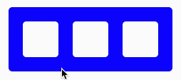
In the component below, we have a container div that has three child divs inside of it. Container div uses the same onClick animation that we’ve seen before:
const Five = () => {
const container: Variants = {
active: {
background: "#ff00b1"
},
disabled: {
background: "#0D00FF"
}
};
const [active, setActive] = React.useState(false);
return (
<motion.div
variants={container}
animate={active ? "active" : "disabled"}
onClick={() => setActive(!active)}
className="container"
>
{[0, 1, 2].map(value => (
<div key={value} className="box" />
))}
</motion.div>
);
};
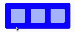
Now we can animate children elements simultaneously with the parent by setting their own variants object. When descriptive names of child animations match those of the parent, child animations will be triggered at the same time as parent animation.
Notice how both container and box variants have the same keys active and disabled:
const Six = () => {
const container: Variants = {
active: {
background: "#ff00b1",
},
disabled: {
background: "#0D00FF"
}
};
const box: Variants = {
active: {
rotate: 90,
opacity: 1
},
disabled: {
rotate: 0,
opacity: 0.7
}
};
const [active, setActive] = React.useState(false);
return (
<motion.div
variants={container}
animate={active ? "active" : "disabled"}
onClick={() => setActive(!active)}
className="container"
>
{[0, 1, 2].map(value => (
<motion.div key={value} className="box" variants={box} />
))}
</motion.div>
);
};
Configuring variants
Variants also allow us to orchestrate the child animations. We can do that by providing transition property inside the animation object.
For example, we can set staggerChildren children property, which specifies the delay in seconds between child animations:
const container: Variants = {
active: {
background: "#ff00b1",
transition: {
staggerChildren: 0.5
}
},
disabled: {
background: "#0D00FF"
}
};
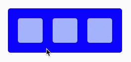
Note how transition is applied only when we transition into a given variant. Since we defined transition property inside active variant, the stagger animation is only applied when we transition from disabled into active, but not when we transition from active to disabled.
By default, variants start animating parent element and its children at the same time. We can control that behavior using when property. We can set it to beforeChildren to make parent element animate first, or to afterChildren, to make parent element animate after its children:
const container: Variants = {
active: {
background: "#ff00b1",
transition: {
staggerChildren: 0.5,
when: "beforeChildren"
}
},
disabled: {
background: "#0D00FF"
}
};
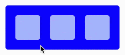
With this configuration, the parent div changes background color first, and then child elements rotate with a staggered delay.
There are a lot more properties of variants that we can control - animation delays, stagger direction, etc. You can find more information on them in framer-motion documentation.
Wrapping up
In this article, we’ve seen how easy it is to animate React components using declarative API that framer-motion provides. However, we just scratched the surface, since there’s a lot more that framer-motion is capable of - gestures, dragging, working with SVG paths and much more. If you’re interested in learning more - check out my new course that covers all the great features that framer-motion has to offer: